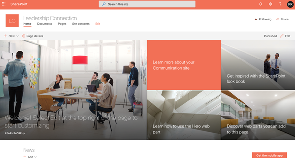
A well-designed SharePoint site not only looks more professional, but also makes content easier to find and digest.
Thoughtful use of color, whitespace, consistent layouts and typography all contribute to a positive user experience.
With some basic knowledge of SharePoint web parts and page editing, you can craft an beautiful site that aligns with your brand and suits your organizational needs.
We’ll summarize key recommendations for balancing aesthetics and usability when styling your SharePoint environment and how to make SharePoint sites look good.
Step 1: Select a Simple, Harmonious Color Scheme
Avoid jarring color contrasts and opt for a soft, complimentary palette. Some examples:
- Earth tones like beige, brown and sage green
- Cool tones like light blue, gray and off-white
- Vibrant analogous colors like orange, peach and yellow
Use a primary color for major elements like headers and backgrounds. Accent with secondary colors for callouts and hover effects.
Pick colors that align with your brand identity. Resources like Coolors or Adobe Color can generate accessible color schemes.
Step 2: Establish Typographic Hierarchy with Fonts
Effective use of bolding, sizes and fonts establishes a clear visual hierarchy on the page, guiding the viewer to key content.
Some best practices:
- Use no more than 2-3 fonts per page
- Pair a serif body font (Georgia) with a sans-serif header font (Arial)
- Use font weights strategically – light for subtitles, bold for titles
- Font size should range between 12px-28px for most text
“Typography is the foundation of web design.” – Joseph Pulitzer
Step 3: Use Whitespace and Borders to Organize Content
Strategic use of empty space makes a site less cramped and more scannable. Section content into digestible chunks using:
- Vertical space between elements
- Dividing borders (lines, subtle color variations)
- Whitespace between paragraphs and around page edges
Step 4: Craft a Visual Hierarchy with Layout
Establish a clear visual hierarchy using consistent positioning, sizes and alignments.
Some elements to style:
- Main header/title
- Sub headers/section titles
- Sidebars, hero images, callouts
- Body text, captions and metadata
Step 5: Pick Classy and Appropriate Images
Relevant, high-quality photographs make a site feel more engaging and “human”.
When selecting images:
- Feature people using your product or service
- Use lifestyle photography or nature images
- Ensure clarity and consistency in image style
- Compress files to optimize site speed
“A picture is worth a thousand words.” – Frederick Barnard
Step 6: Guide the Viewer with Intuitive Navigation
- Logical and visible navigation menus are crucial for usability.
- Link major pages directly from the main menu.
- Use dropdowns or breadcrumbs to reveal additional layers.
- Iconography and text should clearly indicate destination.

Step 7: Use Web Parts Strategically
SharePoint’s building blocks, web parts, allow you to insert and configure elements on a page.
To maximize visual appeal:
- Show important web parts higher up
- Set consistent widths and spacing using borders and dividers
- Adjust widths responsively for smaller screens
Common web parts like news carousels, timeline views and embedded media can make content more engaging when designed thoughtfully.
Step 8: Check Accessibility Standards
Follow web accessibility guidelines to ensure usability for all.
Some key aspects:
- Sufficient color contrast between text and background
- Alternate text descriptions for images
- Logical focus order and shortcuts for low vision users
- Screen reader compatibility


