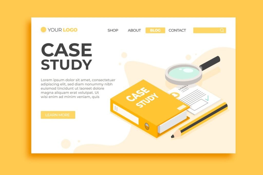
The best case study websites are a powerful sales tool for demonstrating your product or service value to prospective customers. But simply listing case studies isn’t enough – you must craft a site experience that captures attention and guides visitors to convert.
In this article, we’ll cover essential elements for optimizing your case study website including user-focused design, engaging content, and conversion-driving calls-to-action.
Deliver a Seamless User Experience
Since many potential customers will arrive from organic search, focusing first on user experience is crucial. A difficult site will cause them to leave quickly. Some UX best practices:
- Use responsive design to optimize for all devices. Content should reformat cleanly for mobile.
- Ensure fast page load speeds through image compression and caching.
- Organize navigation menus logically so visitors can easily find case studies.
- Balance page content with white space. Avoid clutter.
- Include search to help users quickly find relevant case studies.
Optimizing core UX makes your brand appear professional and establishes credibility.
Guide Users With Intuitive Information Architecture
Additionally, guide visitors with clear information architecture. Organize case studies by:
- Customer industry
- Use case/problem type
- Product/service line
Well-structured IA, including segmentation by customer profiles, helps visitors instantly find the most relevant proof points.
Create Compelling Case Study Content
The content itself must compellingly communicate the value you delivered for each customer. Case studies should highlight:
- The specific issues and challenges the customer faced.
- How your product or service solved those issues.
- Quantifiable metrics and results achieved.
- Customer testimonials validating your impact.
- How the solution was tailored to the customer’s needs.
Convincing details are crucial for establishing your ability to drive results.
Incorporate Engaging Visuals
Enhance case study content with visuals that bring the narratives to life, like:
- Infographics conveying key statistics and metrics.
- Charts highlighting improvements over time.
- Photos and illustrations showcasing customer environments.
- Videos of customer interviews discussing solutions.
Visuals make case studies more immersive while improving information retention.

Guide Visitors to Convert with Strategic CTAs
Compelling calls-to-action are needed to convert engaged visitors into leads and sales. Strategically place CTAs to prompt visitors to reach out or schedule demos after reading case studies.
Effective CTA tips:
- Place contact and scheduling buttons prominently above the fold.
- Use high contrast colors to make CTAs stand out.
- Reduce friction with forms that allow immediate inquiries.
- Use overlays and popups to collect lead information.
- Place CTAs along the visitor conversion path you’ve mapped.
Smart CTAs make next steps obvious for visitors that are productively moved through your case studies.
Crafting a high-converting case study website is crucial for leveraging your customer success stories to attract new business.
Follow core principles of intuitive design, compelling content presentation, and strategic calls-to-action. Your case study website can become a valuable sales generator.


